Planwisely
- Branding
- Web design
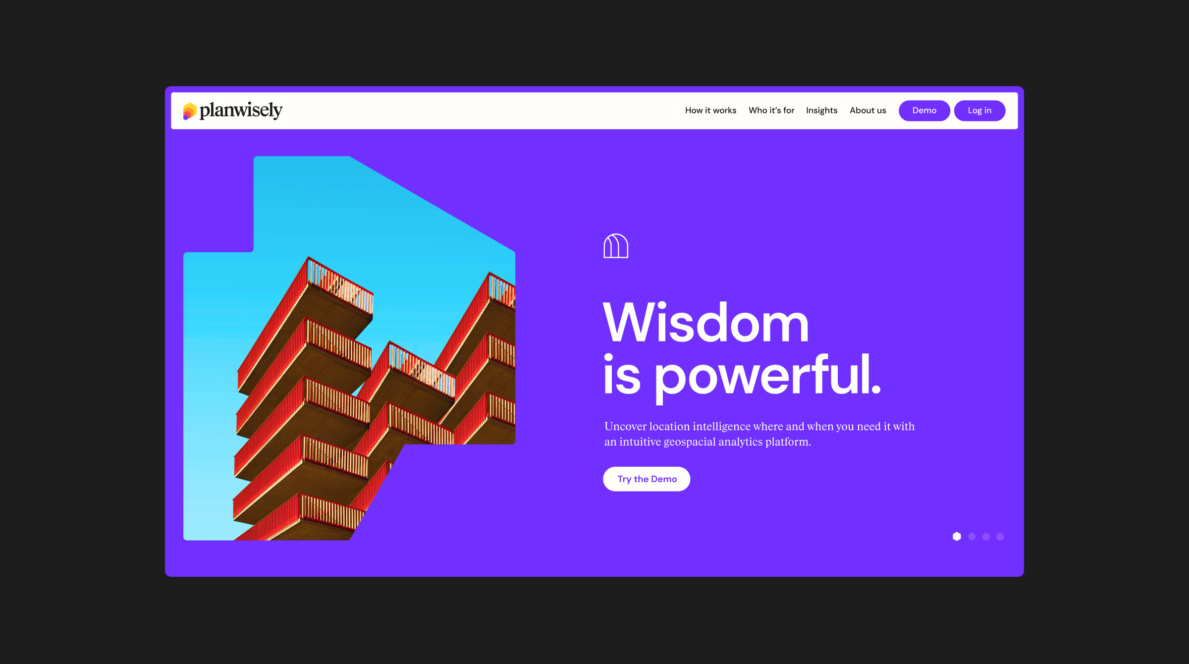
Planwisely is a subscription-based geospatial analytics platform that’s designed to give planners and policy-makers evidence-based insights into urban, regional and open space environments.
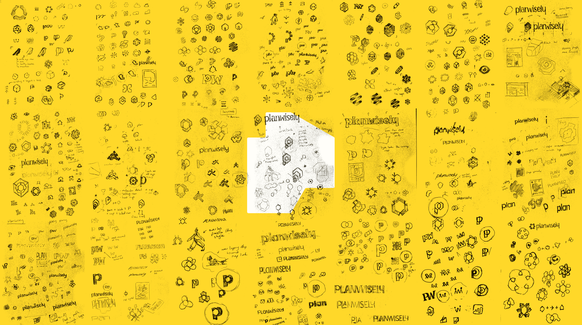
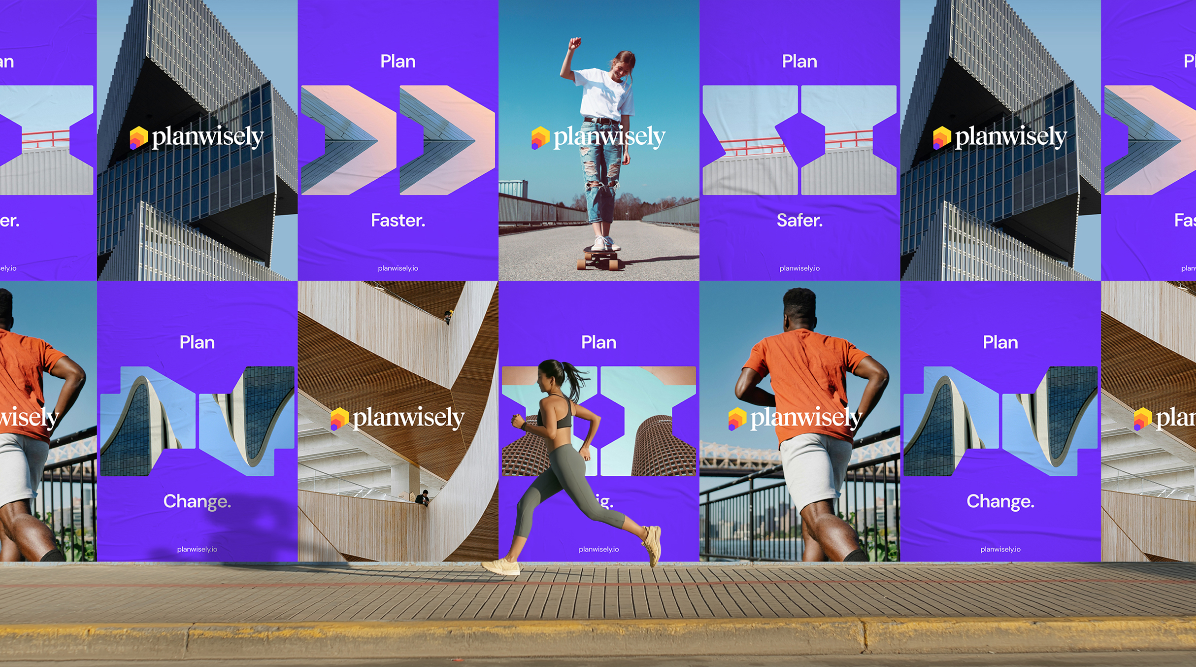
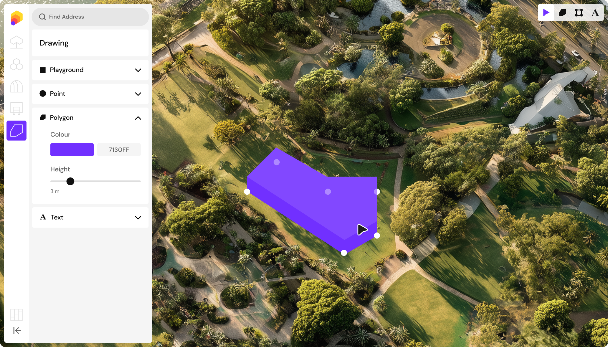
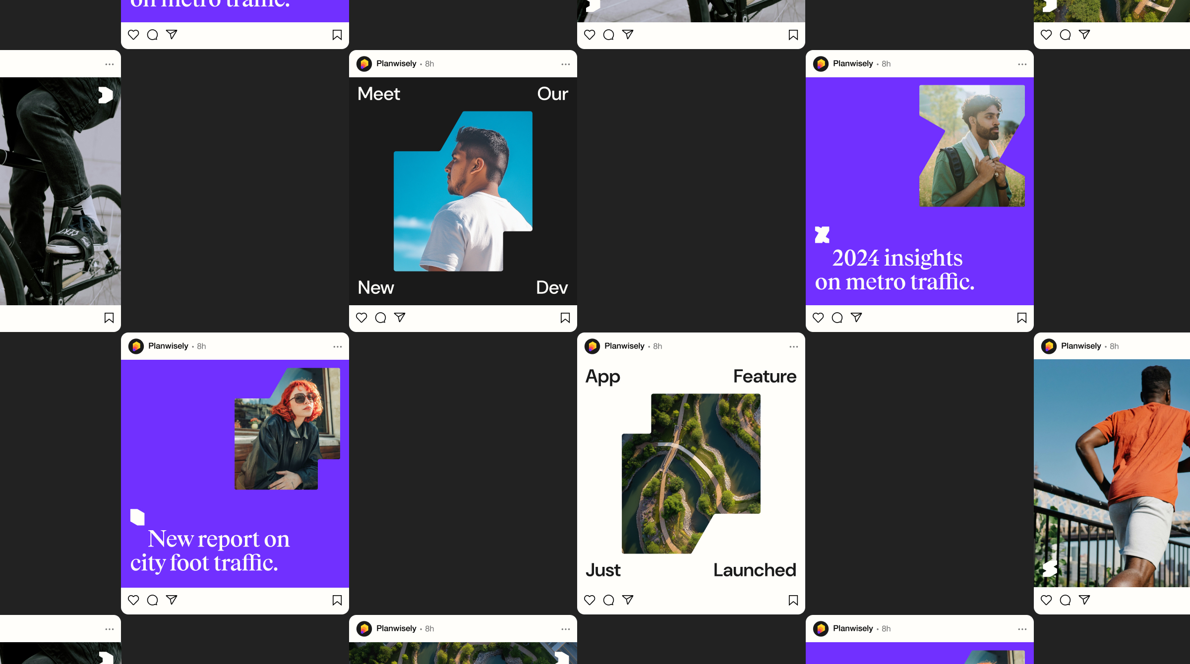
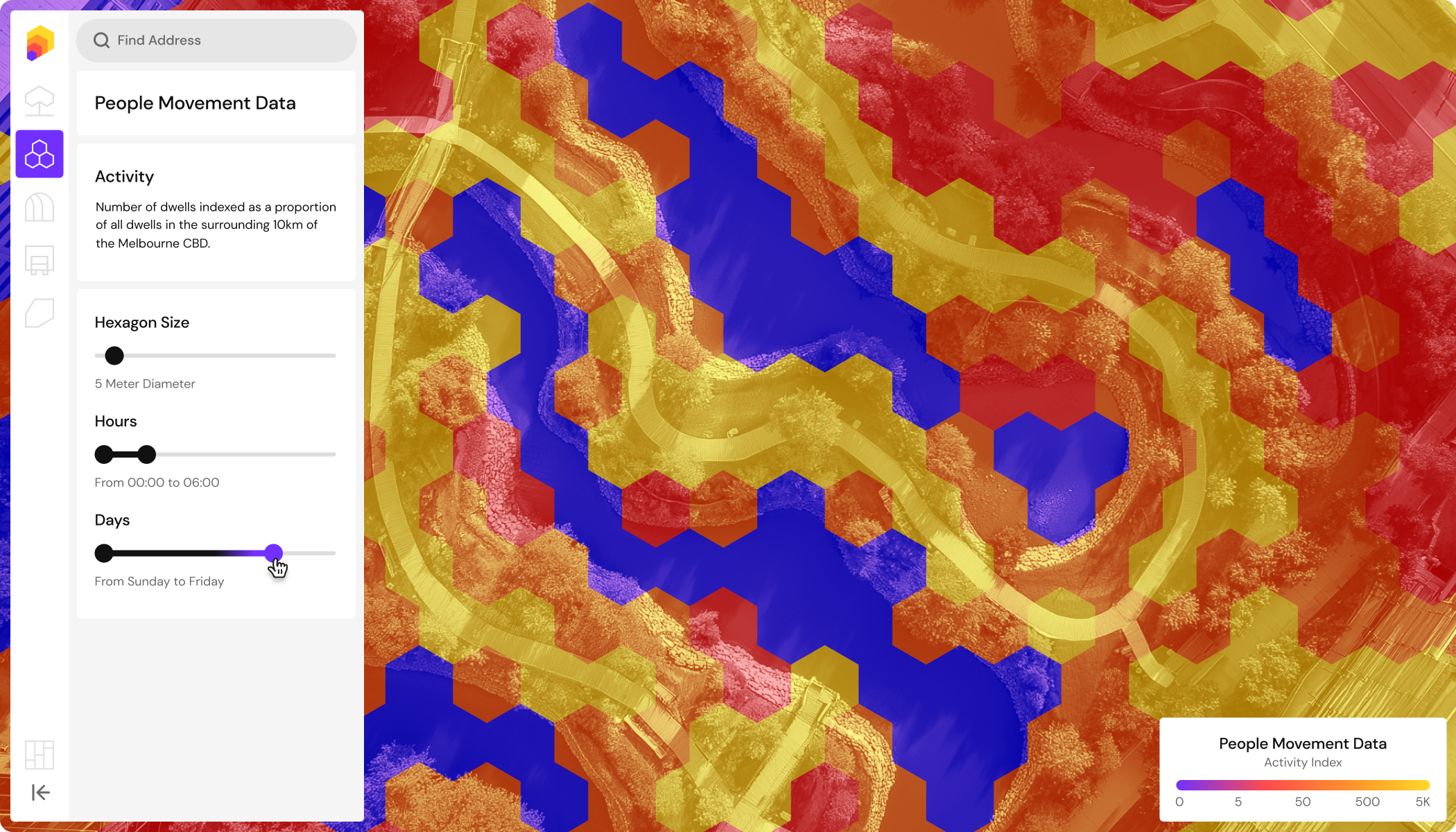
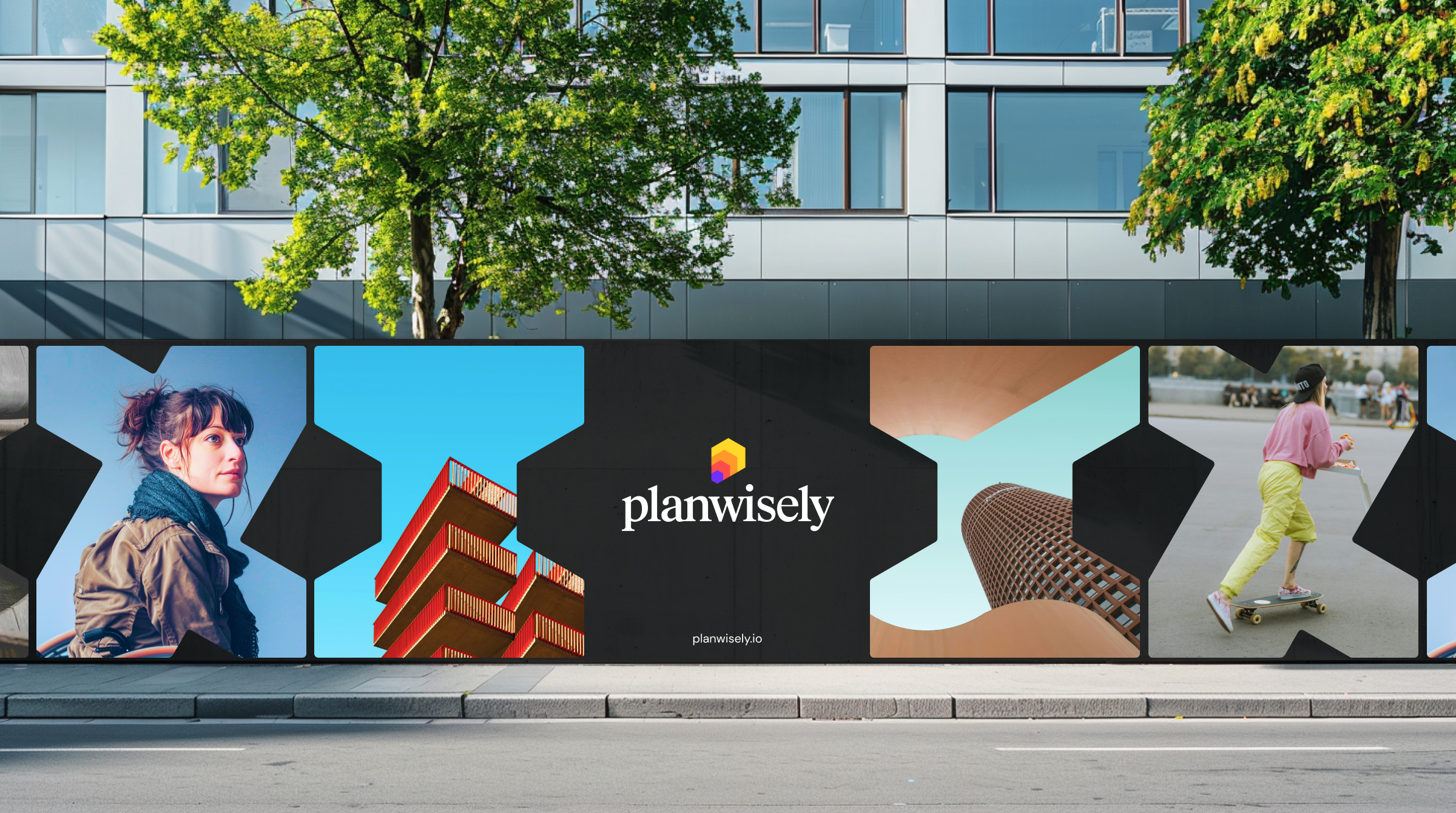
The new brand identity is built around Planwiselys core service – the people movement heat map. This is represented universally as a repeating multicoloured hexagon pattern. Repeated and scaled up, the hexagon forms the abstract P of the logo Icon which also takes on the look of a 3D building (an in app feature) and a shape selection tool (another app feature). It also conveys a sense of movement which is echoed in the brand layouts across different formats.
A brand shape system was also built from the hexagons proportions. These shapes act as abstract representations of many of the Planwisely app features.
Results
Secured $1M USD in funding
Expanded app features
Grew dev and sales teams